Here are some menu design tips for casual dine-in restaurants
In many cases, the menu is the first thing your guests will see when they arrive to sit down at your casual dine-in restaurant. It's not uncommon for a customer to scan and assess the menu before a server has even had the chance to approach the table, emphasizing the importance of getting your restaurant menu design right.
Multiple-page menus replete with tacky photos and illegible fonts are a one-way ticket to a poor first impression and lower revenues. However, if you manage to nail the design and aesthetic of your menu, suddenly it transforms into one of your most potent sales tools.
So how exactly can you achieve this outcome? Fortunately, we've compiled a list of tips for you so you can avoid the mistakes made by those who've gone before you.

1. It's All About Eye Pattern Movements
The science is yet to agree on where the best place to put your big profit-generating dishes. However, what we do know is that at least a third of diners tend to order the first item they see. Thus, cover your bases by spreading your big earners in all of the likely starting places. Namely, the top left, the top right, and the center of your menu.
Research indicates that we prefer to read a menu from left to right, and sequentially if there are multiple columns. Therefore, put your most profitable menu items in the top left-hand corner and, ideally, make them as eye-catching as possible.
2. Divide Your Menu into Logical Sections
This almost goes without saying. Your customers need to have a clear path to the types of dishes they are looking for. Appetizers, entrées, and desserts should all be easily distinguishable from each other.
Furthermore, if you serve either varied cuisines or multiple types of meals, then make sure to allocate them together in their respective groupings. For instance, you could organize entrées into distinct sections such as "from the grill," "salads," and "pasta dishes." If you have offers or deals for ordering specific items of the menu together, then place them close to each other to make ordering the promotion seamless and frustration-free.

3. Use Boxes and Contrasting Colors for Visual Direction
As eluded to above, you need to use your menu as a tool to make the most profitable dishes jump out. Boxes and bright contrasting colors are both great methods for making the items you want your customers to order "pop."
Let's say you have a special deal on Tuesdays, where you can grab two entrées for the price of one. Box the qualifying dishes off with a "Two for Tuesdays" tagline, followed by a list of brightly colored menu items, and watch the food fly out of the kitchen! It might be prudent to hire a professional graphic designer for these particular sections, ensuring they stand out.
4. Remove Those Dollar Signs!
Studies have demonstrated that diners who order from a menu missing dollar signs spend significantly more than those who are presented with a traditionally priced menu. It appears the appearance of that one seemingly insignificant symbol (dollar sign) can make consumers much more aware of how much they are spending, and therefore they reign back.
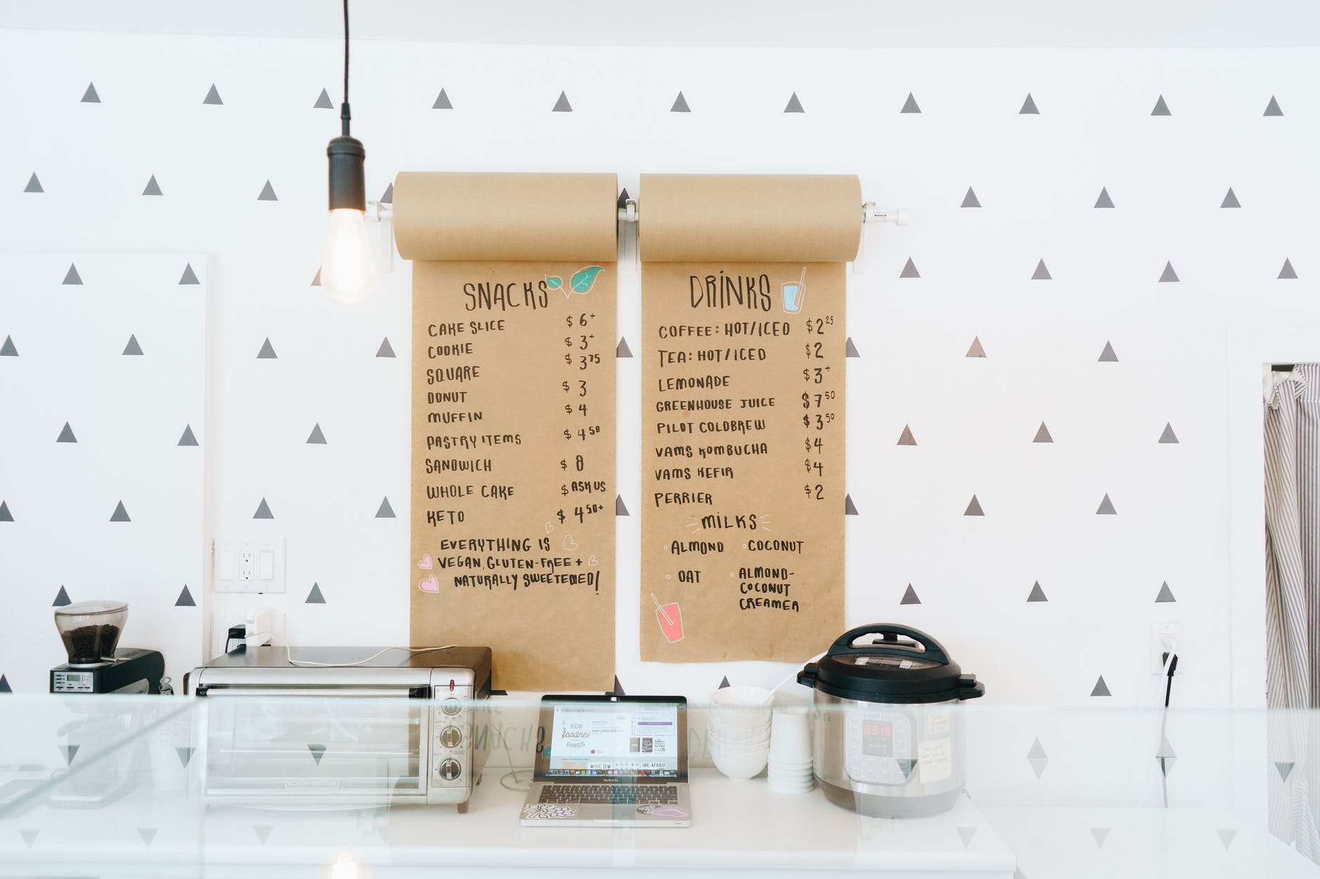
Therefore, make sure to present the menu in a numbers-only format when it comes to the pricing of each dish. Try also to avoid placing food items in one single large column, as the listing of prices so close together invites comparison and therefore increased cost-consciousness.
5. Limit Your Menu Options
While it can be tempting to offer restaurant-goers an expansive menu, the research has repeatedly shown that the more choice provided to customers, the less likely they are to spend. For example, having eight different steak dishes is likely to lead to customers avoiding them altogether and ordering an alternative meal with a much tighter profit margin.
Having a streamlined menu is also one of the best strategies when it comes to thinking about how to increase restaurant profit. It leads to increased efficiency in the ordering process, reduced inventory costs, and helps to maintain the speed of service from the kitchen.
6. Get Descriptive!
Succulent, crisp, juicy, melt-in-your-mouth, these terms all invoke an instinctive reaction of hunger, so use that to your advantage. Don't hold back on the descriptive language while minding not to make the menu unnecessarily wordy.
A study undertaken on behalf of The Association for Consumer Research found that descriptive menu labels increase sales of an item by 27%. Better yet, they resulted in customers feeling more satisfied with their meal, making them more likely to leave favorable feedback.
7. Leave Photos for Instagram
It can be tempting to put photos beside your best menu items to give customers that extra nudge to part with their hard-earned money. While menu photos can sometimes increase orders, they can also lead to problems.
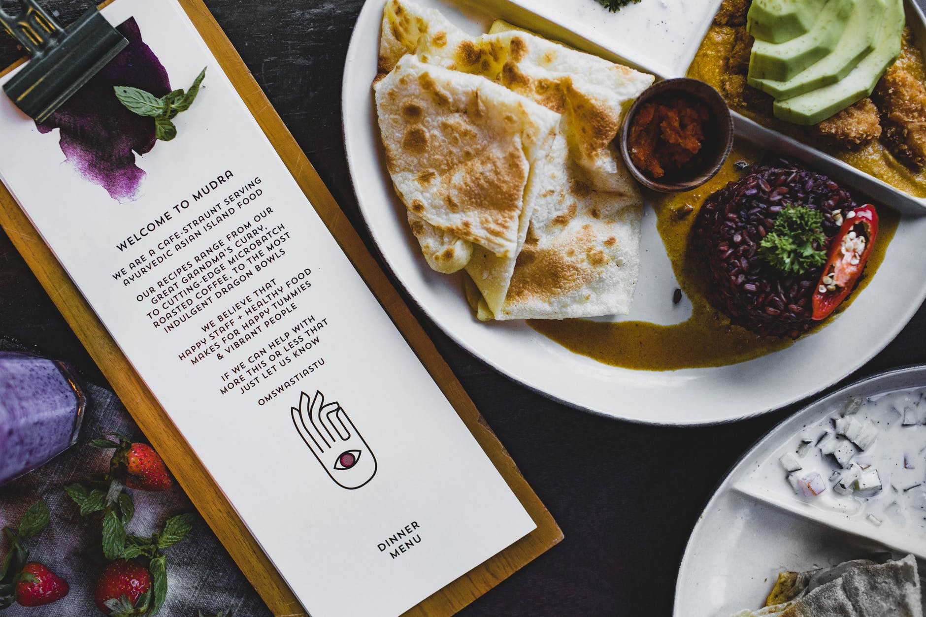
Firstly, menus with photos are associated with fast-food restaurants, which can cheapen the feel of your casual concept. Then there's the issue of poor-quality photos putting off customers altogether. Finally, even if you do manage to include a superior quality photo of your food, if what arrives at the table doesn't match up to that visual representation, then you've created a no-win situation for both yourself and the customer.
A Well-Designed Menu Is an Excellent Sales Tool
While it's true that it may take some initial experimentation to see what works best for your casual dine-in restaurant, by following the tips laid out above, you can cut a significant chunk out of the learning curve and head straight to a conversion-driving menu. Remember, it's only one part of your multi-faceted restaurant marketing strategy. However, if you manage to get the restaurant menu design right, you're in for a much smoother ride.
If you would like to receive more expert advice on restaurant marketing strategies, talk to a member of our team today about the role your POS system can play in promoting your casual dine-in concept to new customers.
